We take 'Partner' Seriously
Which means we take your time seriously. We will reach out shortly after you submit this form.
B2B vs B2C Website Design

Author: Brad Gronek
Published: November 29, 2022
Every business’s website begins with the same simple, fundamental question: who is the customer? In this article, we explore the differences between websites which sell to businesses (business-to-business or B2B) and those which sell to consumers (business-to-consumer or B2C). When most people think of e-commerce, they think of flashy consumer websites like Tesla, Nike or Apple or marketplaces like Amazon or Walmart. In fact, according to Statista, B2B ecommerce volume eclipsed $6.7 trillion in 2019, and is expected to grow at a rate of 20% per year through 2030. Therefore, the distinction between B2B and B2C website designs is very important.
Buyer Sentiment: Know your customer
When creating and managing your website you must know your target audience in order to achieve marketing effectiveness. B2C consumers are driven by desire and emotion. We as consumers want to surround ourselves with things that represent who we are and things that make us comfortable, excited, or whatever our tastes are. Take the most iconic consumer good of all, the car. It’s not hard to close your eyes and envision our ultimate automotive experience be it on a race track or driving comfortably through the mountains. These desires are very carefully considered by marketers when designing digital experiences.
On the other hand, B2B buyers are driven by logic and, to a certain extent, fear. Buyers want to make a good impression on their team and so want to make a well informed decision looping in key, qualified stakeholders in order to drive success. Once a decision is made, operational efficiency is key as the relationship between customer and vendor continues to drive success through services, parts or continued expansion of the relationship.
These considerations drive choices in personas, design elements and features to drive effectiveness for your customers.
Visual Design Queues
Designing for B2C
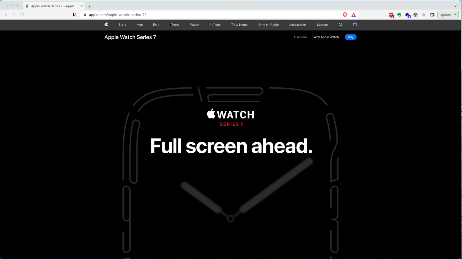
When designing a site targeting consumers, you will be appealing to emotion and desires. Therefore, a deliberate content strategy should reveal the key interests aligning the consumer with the product. Put simply, find out what about your product the consumers want, why they want it and give it to them. Focus on as few personas as possible in order to keep the message crisp and direct. Imagery will often be larger and more dramatic, enticing viewers to envision themselves using the product. One great example is the Apple Watch product page with its huge screen-sized images and scrolling animations. In fact, I was almost enticed to buy an Apple Watch while writing this article. Key factors include simple content, clear pitch and it spoke to my desire for a rugged, capable exercise watch. Too bad I’m already happy with my Garmin!
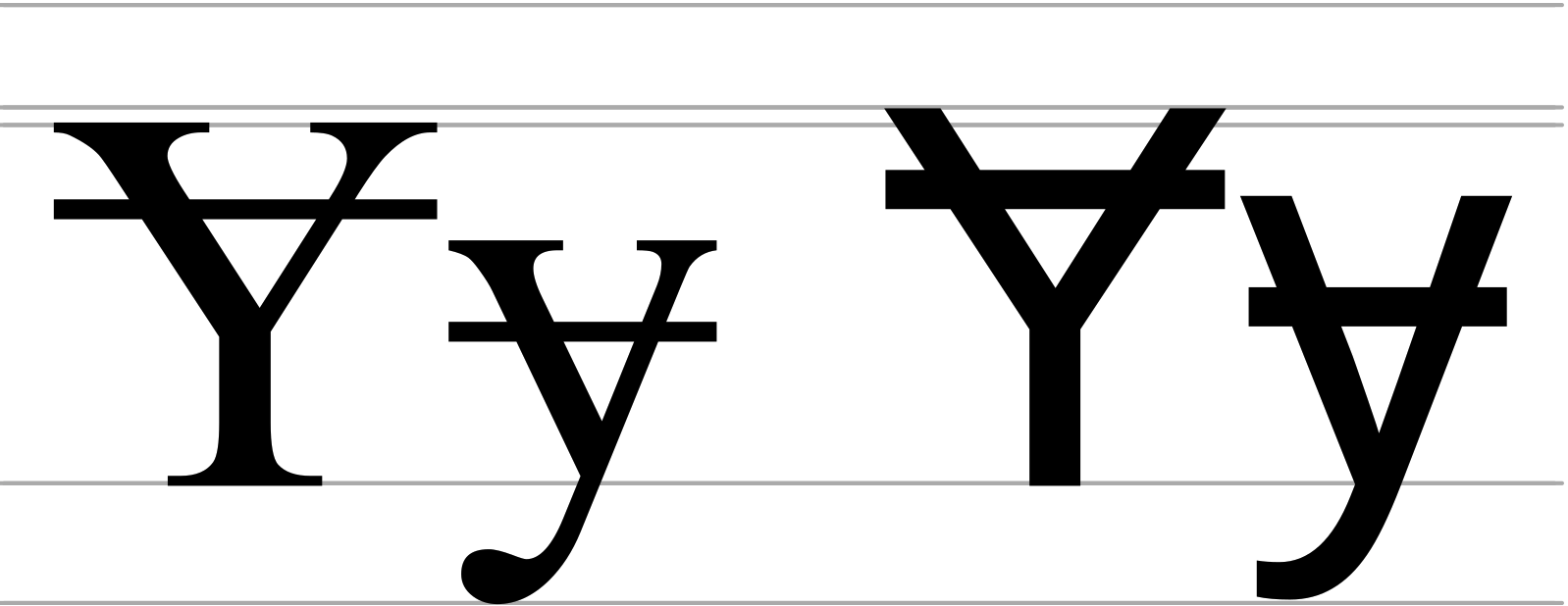
Typography (or font) is another key design element that greatly influences the site’s aesthetic and readability more than the typical user can imagine. There are two major classes of font: serif and sans-serif. A serif is a projection from the end of a line. Use of serif fonts can give a more scholarly or professional mood. Therefore, as you can imagine, B2C sites will often forego serif fonts in favor of the simpler, more readable sans serif fonts.
When building e-commerce websites for B2C, content is king and the checkout experience must be as minimal and simple as possible. Here is where you don't want to stand out. If your customer gets through the entire checkout process and their product is on the way before they even think about the interface, you have won this battle. Effective integration with third party wallets and fulfillment providers can certainly ease the way here, but an intentional, well planned user experience can make all the difference.
Designing for B2B
B2B customers on the other hand are all about detailed product data and operational efficiency.
When it comes to visual design for B2B, there are a few key things to keep in mind. First, B2B customers are all about detailed product data and operational efficiency. So your website design should reflect that, with plenty of clear, concise information and easy-to-use navigation. Second, B2B customers are often making large purchases, so your website design should be persuasive and professional. And finally, B2B customers are likely to return to your website time and again, so make sure the design is engaging and visually appealing yet simple.

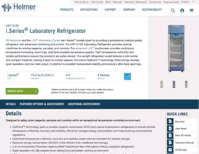
Another key to B2B design is efficient use of space to share sometimes vast amounts of product information in an easy to use way. In the following product page, the same page is used to share product specifications, manuals and architectural diagrams in addition to the typical product descriptions and images. Design for and management of so much product data is only possible through tight collaboration between you and your designers.
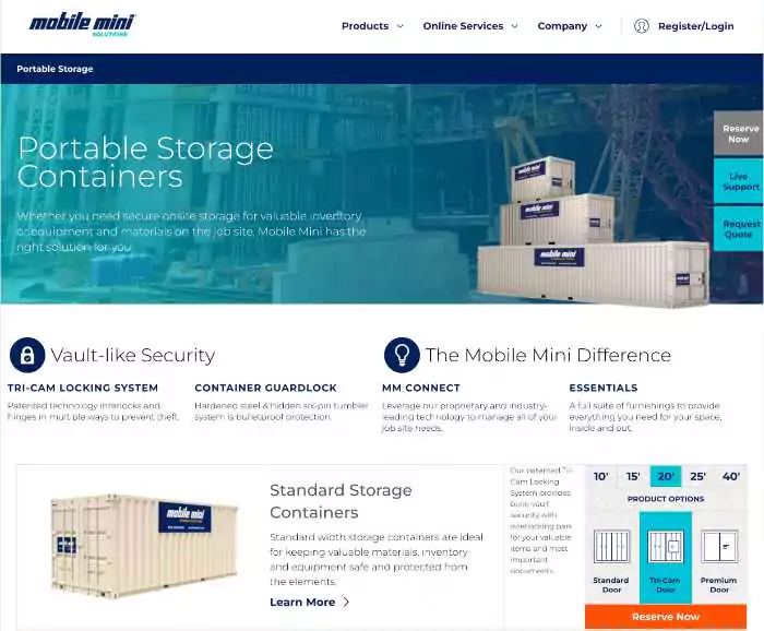
One of the challenges inherent in B2B design is the presentation of complex product offerings in easy-to-use ecommerce experiences which enable purchases in the field and on the go. In this example, an embedded product configurator allows users to select a product, open an integrated live chat session and quickly move from decision to order very quickly. This aids customers who are on a job site and in need of storage solutions without delay.
What features might B2B and B2C websites often include?
B2C e-commerce experiences focus on experience, decision and checkout. The closer the customer can get to the product without too much fuss, the better. The buying experience needs to be efficient and is best kept to a simple cart, checkout, credit card model with reviews and testimonials to improve the shopping experience and a means of checking back to see the status of orders.
B2B websites don’t just focus on the buying process, but the entire customer journey. B2B companies offer more complex products and services that require a longer consideration time and may have a higher price tag. Because of this, B2B websites must be designed to nurture leads through the entire sales funnel. Furthermore, B2B websites often implement more complex business arrangements such as distributorships, customer-centric price lists. The possibilities are limitless; however, some features we have implemented include:
- Product customization and configuration.
- Custom price lists for customers or customer classes.
- Support for distributorship relationships to compensate distributors for their customer relationships.
- Support for international business regulations governing certain products.
- Restricting certain products to specified countries.
- Geo-location features to support product delivery ala DoorDash.
- Certifications and licensure management for controlled products such as pharmaceuticals.
- Re-purchase or scheduled purchasing.
- Personalized experiences to support longer sales cycles.
- Product Configurators
- Omni-channel experiences which support customers in the field.
- Multi-role purchasing workflows supporting separation of duties among shoppers, approvers, payers, etc.
- Detailed product documentation and specifications.
What technologies are employed for B2C and B2B ecommerce sites?
B2C websites will usually require more homogeneous user experiences focused primarily on providing a strong pitch and a smooth checkout process. For this reason, B2C websites and ecommerce experiences are often built using common templated platforms such as Shopify or WooCommerce.
When choosing a technology platform for a B2B websites and e-commerce experiences, more flexibility is required to support the long list features and that are often required. For this reason we will often recommend Drupal Commerce, BigCommerce or one of the decoupled platforms such as Elastic path or Commerce tools. These tools are more robust and more easily modified to efficiently adapt to the needs of your business and your customers.
Conclusion
In conclusion, B2B and B2C websites differ in audience characteristics, design, features and preferred technologies. When approaching a B2C website, a templated design and use of a platform such as Shopify might fit the bill whereas B2B websites typically require tighter integration, more carefully crafted user experiences and more flexibility to absorb custom requirements.
At Igility, we have experience dealing with both, so feel free to reach out if you have any questions or are starting to consider your next project.
